We have created a series of drop-down boxes filled with links to charts and other resources.
Equity Markets
The following links use the S&P 500 as the basis for market analysis.
NYSE McClellan Summation Index
S&P 500: Equal Weight vs Cap Weight
% Above 200-Day Moving Average
Correction Indicators (Moving averages, Bonds, Dollar, Tech v. Energy)
Tom Lee Market Trend Indicators
Stocks
Momentum (Moving Averages, RSI, Relative Price, Slope)
The following charts include the moving average, RSI, slope, and rate of change.
Bollinger Band (50-day)
Rate of Change (50, 200, 375 days)
Cross Market Indicators
This chart tracks the relative price of lumber versus gold, the dotted line in the center graph. When lumber prices are rising faster than gold, economic growth is generally positive, and (theoretically) investors are more willing to invest in stocks. When the relative price is falling, investors are more risk-averse.
The top-line measures the rate of change (ROC) of the relative price over 13 weeks. When the ROC is positive, lumber is rising faster than gold. When ROC falls below zero, gold is rising faster than lumber, a yellow flag for the market.
If you would like to learn more about these indicators, I recommend you read Michael A. Gayed, CFA's research reports: Lumber: Worth Its Weight in Gold and An Intermarket Approach to Tactical Risk Rotation. Michael Gayed publishes The Lead-Lag Report which uses his research. His work can also be found on Seeking Alpha.
This chart is very similar to the lumber/gold chart. In this case, we are looking at the relative price of copper versus gold. The same dynamic is at work. When copper is rising faster than gold, i.e. the ROC is positive, investors are willing to buy stocks and when negative, investors are less willing to take on risk.
Instead of commodities, this chart looks at the performance of 20-30 year U.S. Treasury bonds (in this case we're using the exchange-traded fund, TLT) versus 7-10 year U.S. Treasury bonds (using IEF).
The price of long-term treasury bonds rising faster than intermediate bond prices (the line in the center graph) indicates investors believe the economy is weakening and inflation is likely to fall rather than rise. It also suggests that stock market investors are becoming more cautious. Conversely, when long treasury prices are falling relative to intermediate bonds, investors are expecting the economy to grow more rapidly and inflation to rise. This is generally positive for the stock market.
The easiest way to read this chart is to look at the ROC line at the top. In this case, when the 4-week ROC is positive, stocks are at risk, when it is negative, it is positive for the market. (I realize this is the reverse of the other charts but that's the way it's drawn.)
This is a chart of the relative price of utility stocks (using the ETF: XLU) versus the S&P 500 (using SPY). When XLU is rising faster than SPY, investors are becoming more defensive and lowering the risk profile of their portfolios. Conversely, when the relative price of utilities versus the S&P 500 is falling, investors are becoming more aggressive and willing to add risk (i.e. buy stocks) in their portfolios.
Again, the easiest way to read this chart is when the ROC is positive, caution is warranted. When the ROC is negative, it suggests clear sailing for the stock market.
Valuation
These charts track several valuation metrics for the market to help us determine whether or not stocks are attractive.
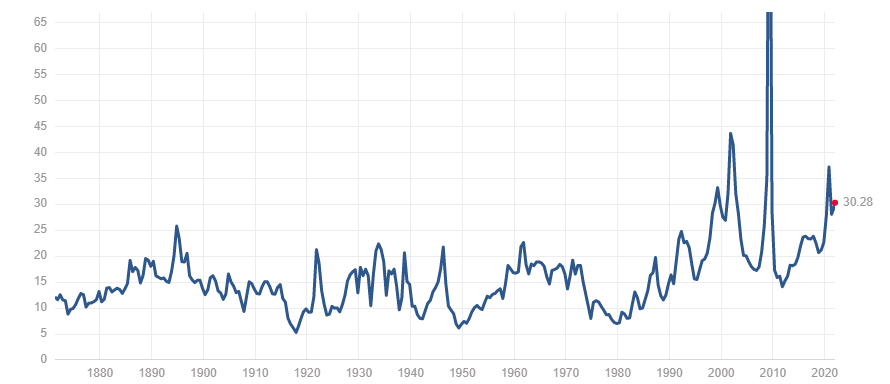
P/E Ratio - S&P 500 (as of 12/30/21)
This measure of valuation is simply the price per share divided by earnings per share. When this measure is high, stocks are viewed as being expensive and future returns may be disappointing. When low, the P/E ratio suggest stocks are inexpensive and returns may be higher than normal.
Note: P/E ratios are affected by a number of factors such as fundamentals, growth, interest rates, and much more. So while P/E ratios are a helpful measure of valuation, it is not the sole determinant of value. Like any tool, use it with caution.
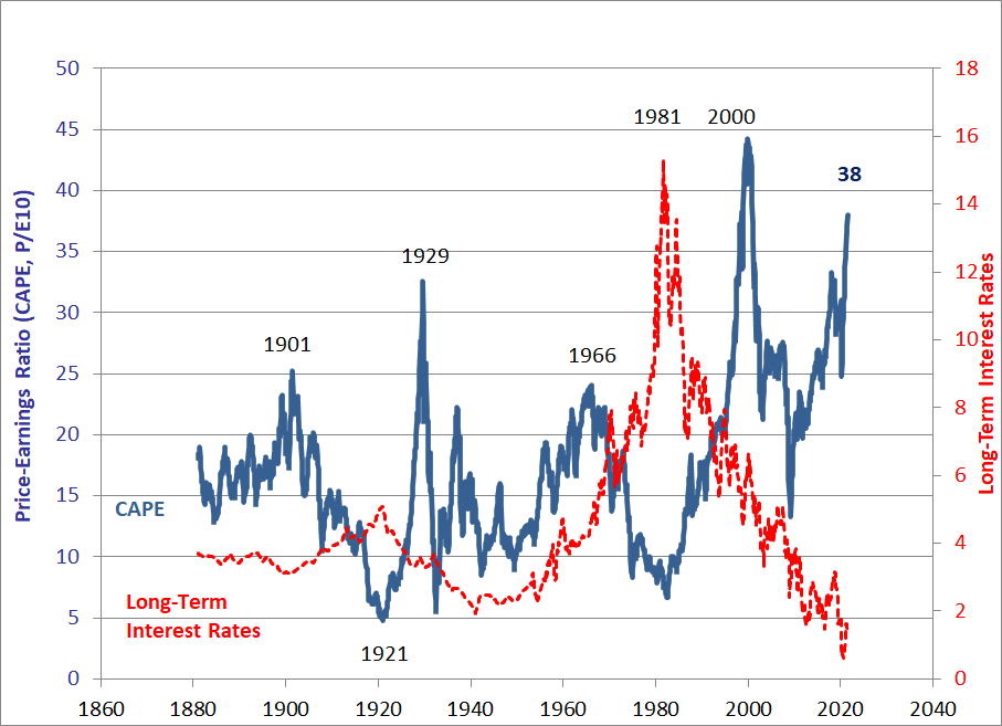
Shiller Cyclically Adjusted P/E Ratio (CAPE)
Economist Robert Shiller developed CAPE to reduce the impact of fluctuating earnings (the "E" in the P/E ratio) by using a 10-year moving average of earnings as the denominator.
The chart below is produced monthly and shows both CAPE and long-term interest rates. Note how the two series tend to move in opposite directions.
The link at the bottom of the chart takes you to an online spreadsheet with the charts and data which you may download.
For a quick, real-time look at the CAPE use this link.
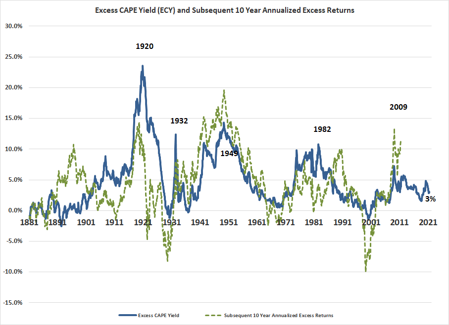
Shiller Excess CAPE Yield (ECY)
The ECY is the inflation-adjusted earnings yield (the inverse of the P/E or E/P if you like) of the S&P 500 less the yield on 10-year U.S. Treasury bond yields. When the ECY is greater than zero, we can expect that returns on stocks will be positive over the subsequent ten years. The opposite is the case when the ECY is less than zero.
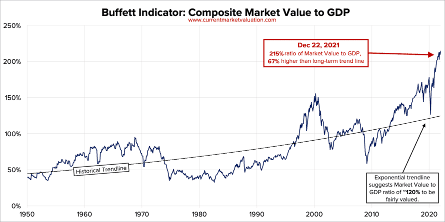
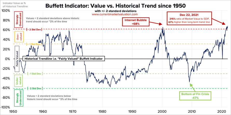
Buffett Indicator
Warren Buffett is famous for the eponymous, Buffett Indicator which measures the aggregate value of the equity market against GDP.
The first chart in this series shows the actual ratio. It also includes a trend line based on more than 70 years of history. When the Buffett indicator is well above the trendline it suggests the market is expensive. Conversely, when the indicator is below trend, stocks are "cheap".
The second chart measures the deviation of the indicator from that trendline. As noted on this chart, when the indicator rises above one standard deviation stocks are considered "overvalued". Not surprisingly, when the Buffett Indicator is more than one standard deviation below the trendline, the mark is considered undervalued.
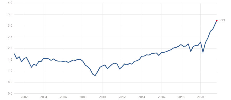
P/S Ratio (S&P 500)
The price-to-sales ratio is another useful valuation indicator. It is calculated just like the P/E ratio using sales per share instead of earnings per share. Because of its focus on sales, you don't have to worry about the impacts of write-offs, differences in business models, accounting gimmicks, etc.
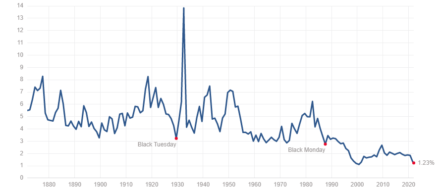
Dividend Yield (S&P) 500
The dividend yield is yet another way of determining valuation. It is calculated by dividing the dividend per share by the price per share.
An unusually high dividend yield for the market suggests the market may be undervalued. Conversely, an unusually low yield suggests stocks may be overvalued.
Importantly, when looking at individual stocks, a high dividend yield might by suggesting elevated risk rather than opportunity.
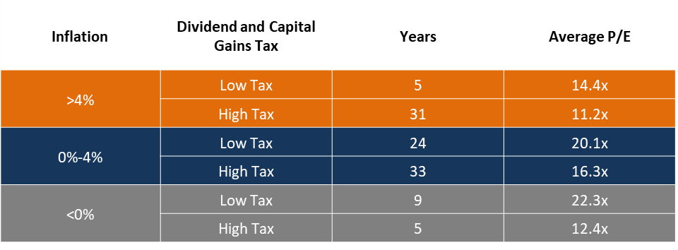
Valuation Regimes
Inflation and taxes can have a powerful impact on valuations. This chart is based on a study by Rober Shiller of valuations in various environments of low and high tax rates on capital (capital gains and dividends) and inflation.
I refer to this chart regularly as a check on where we are in the spectrum of valuation regimes. For example, for the past number of years, we have enjoyed low inflation and low taxes. While the market's valuation has been high as noted in the charts above, it appears justified by the valuation regime.
Today, inflation is rising and there is talk of raising taxes on capital. This suggests the market's valuation may fall as we enter this new valuation regime.
Momentum
We use momentum indicators to help understand the underlying trends in the stock market because it's a lot easier to make money when asset prices are rising!
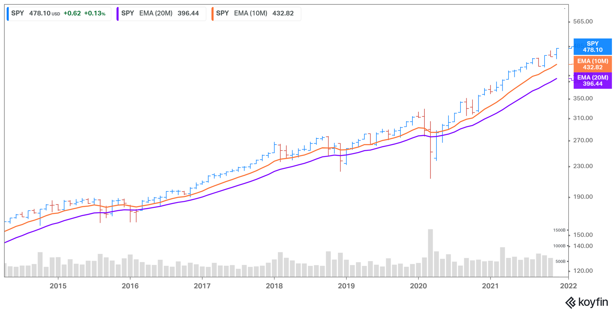
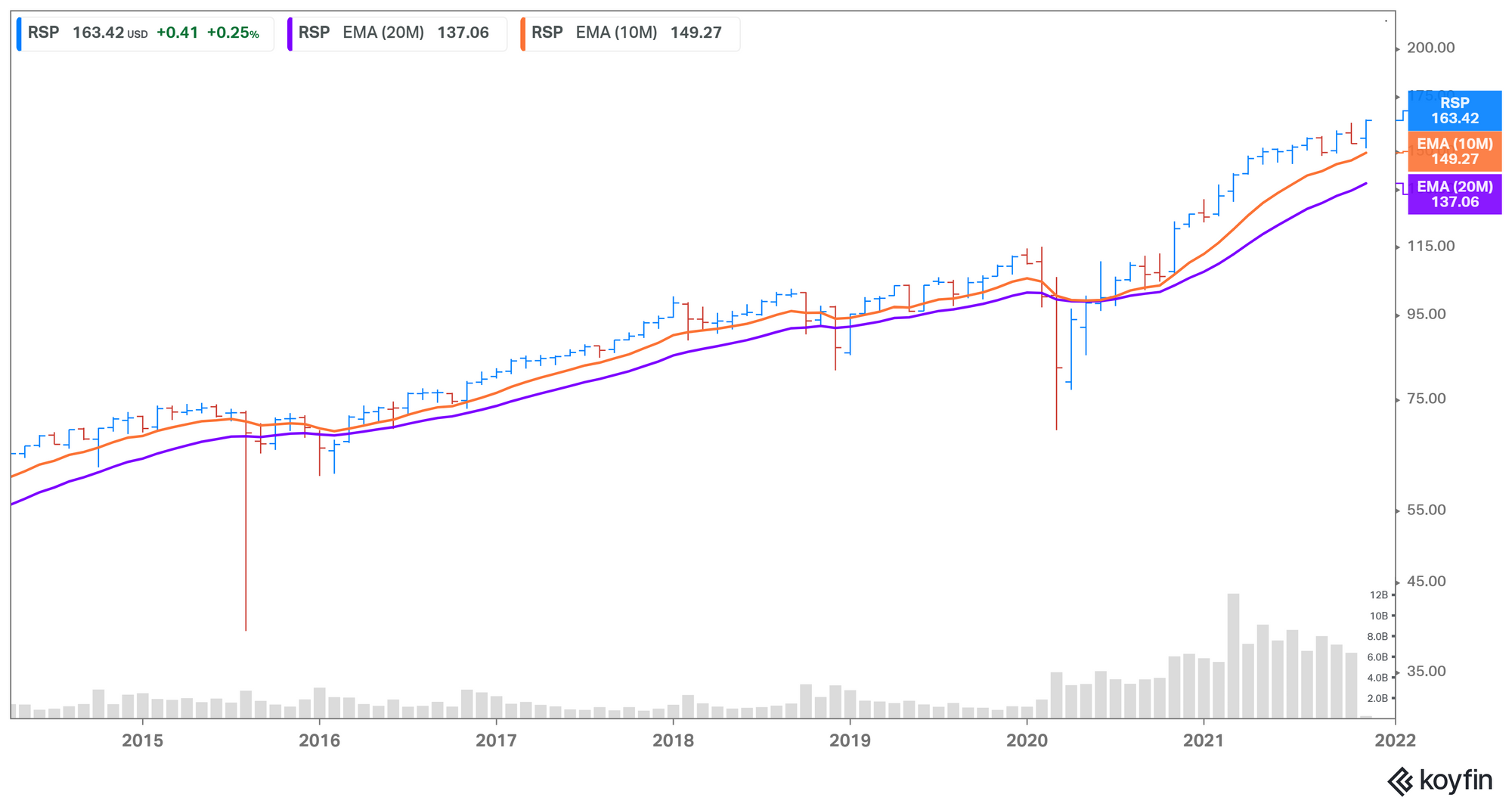
Moving Averages
Traders use moving averages in a variety of ways to help them time their buys and sells. As a long-term investor, I use moving averages to discern the underlying trends in the market. To the charts below of the S&P 500 (SPY) and the equal-weighted S&P 500 (RSP) include both the 10-month and 20-month exponential moving averages. (An exponential moving average places more weight on the most recent prices versus a simple moving average which places weight equally across the series of prices.)
When these long-term moving averaging lines are rising and the market price is above the line, we're in a bull market. When the market is below a falling line, it's a bear market. Note: these long-term moving averages are best reviewed at each month's end.
S&P 500 (SPY)
Equal Weight S&P500 (RSP)
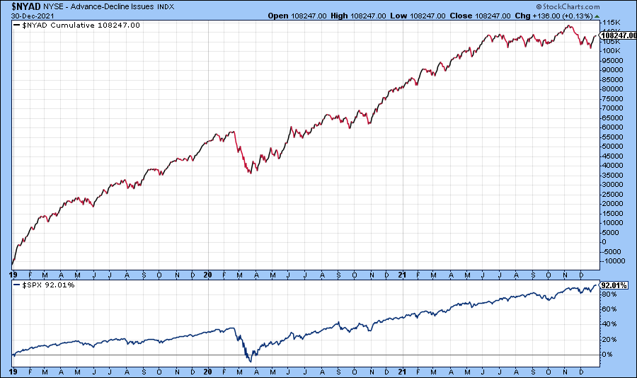
NYSE Cumulative Advance-Decline Index
In addition to moving averages, we can gauge market momentum by looking at the number of advancing stocks vs declining stocks. Not surprisingly, during a bull market, more stocks are rising than falling. In a bear market, the opposite is true.
When the direction of the advance-decline index deviates from the direction of the market it signals a potential change in the market's direction. For example, if the advance-decline index begins to fall while the market continues to advance it suggests that a correction/bear market is likely to occur soon.
Miscellaneous Market Indicators
Additional indicators you may wish to consider:
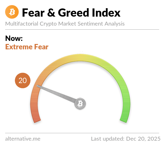
CNN Fear & Greed Index
Under CNN's Terms of Use, we are not able to display their Fear & Greed Index. However, it is a good, quick gut check of market health. Here is a link to the index.
Callan Periodic Table of Investment Returns
The Periodic Table of Investment Returns depicts annual returns for 9 asset classes, ranked from best to worst performance for each calendar year.
Market Data
NYU Professor, Aswath Damodaran, provides a wide array of historical data which you can view or download for free. Follow the link below to see a matrix of the data available, then select the data you wish to view.
S&P Dow Jones Indices
Standard & Poors provides regular analysis of their indexes. Use these links to see the latest available or start from their performance report webpage.
Monthly Global Index Dashboard
Economic Indicators
Sentiment
TD Ameritrade Investor Movement Index