March 19, 2021
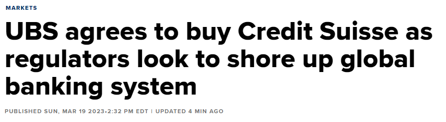
I think it's fair to say the global banking system remains in flux given (among other things) that Switzerland's second-largest bank, Credit Suisse, may not exist by tomorrow. The intermediate and long-term impacts on our economy from the "Panic of 23" are unknown for now. In the short run, however, we continue to experience significant market volatility, an environment that can result in costly mistakes - so be careful!
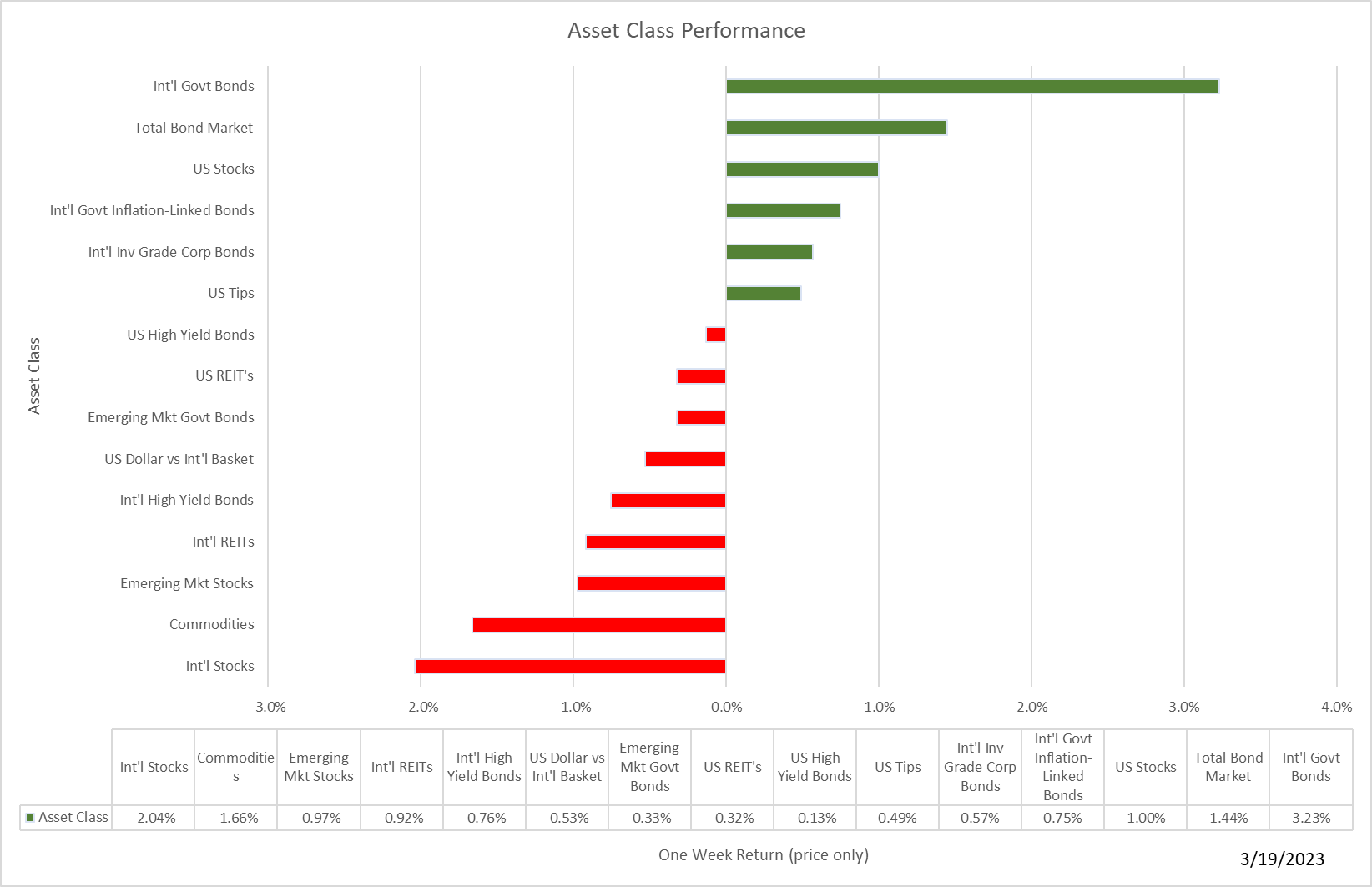
Here is this week's harvest of charts, graphs, tables, and miscellany with some brief comments. (There was a lot to choose from this week!)
Last week could have been worse. Bonds were helped by expectations of at least a moderation of the Fed's interest rate increase and a flight to safety. U.S. stocks did ok as well, helped by some decent earnings reports from the few companies left to report and relief that the SVB debacle appeared to be contained.
Get a more complete picture of last week's market action by downloading our market update report.
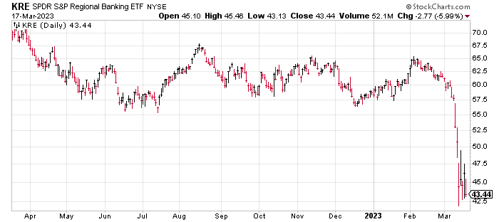
Of course, bank stocks took it on the chin. KRE, a regional banking ETF, closed at a twelve-month low on Friday.
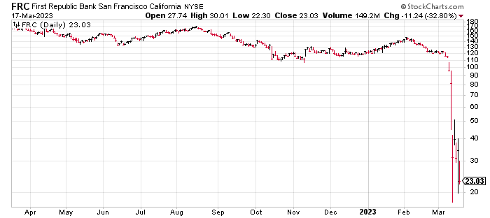
And First Republic Bank, despite receiving $30 billion in deposits from a consortium of major banks, fell to a new low of $23.03 from a high of $169.39 in August, an 86% decline.
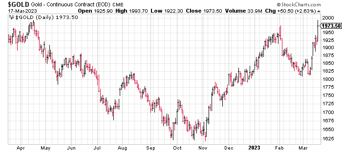
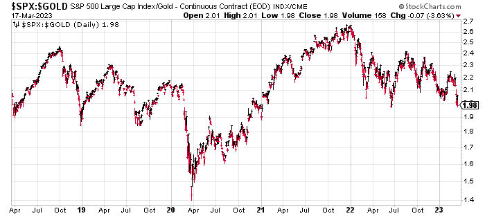
While bank stocks collapsed, gold soared close to its 52-week high.
Here is a chart of the relative performance of stocks vs. gold. Remember, a rising trend means stocks are doing better than gold while a falling trend means gold is doing better than stocks. Clearly, gold has been the champ since the start of 2022 and given all the uncertainty in global financial markets, I wouldn't be surprised to see the current trend continue for a while. By the way, the long-term average of stocks/gold is 1.6 so it looks like stocks remain expensive versus gold.
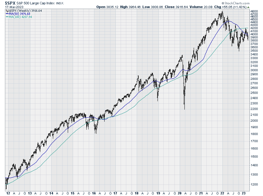
Unfortunately, the turmoil of the past couple of weeks has reversed the improving momentum trends we had seen at the end of February. Here, for example, is the weekly chart of the S&P 500, now trading below the 50 and 100-week moving averages (not good).
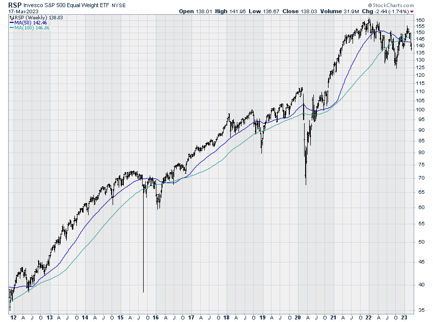
Equal weighted looks just as bad.
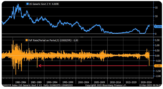
Not surprisingly, interest rates fell sharply as panicky investors fled stocks and opportunists bet on Fed rate cuts to stabilize the banking system. Here for example is the yield on 2-year US Treasury bonds. After breaking above 5% on March 8, by the end of last week, the rate on a 2-year bond was 3.81%.
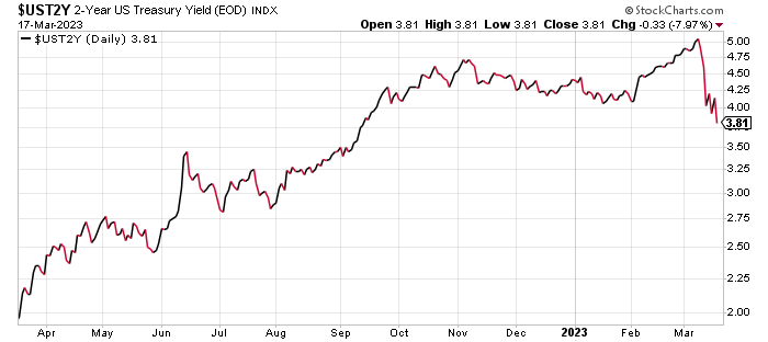
We haven't seen that magnitude of decline since the crash of 1987!
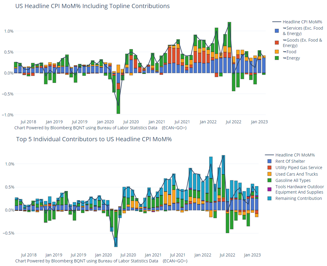
After an unexpectedly strong and inflationary employment report on 3/10 (I erroneously reported it out on 3/3. Guess I just couldn't imagine so much impactful news on one day!) we received some better news on inflation, rising a bit less than expected, driven by rents as you can see in the monthly reports.
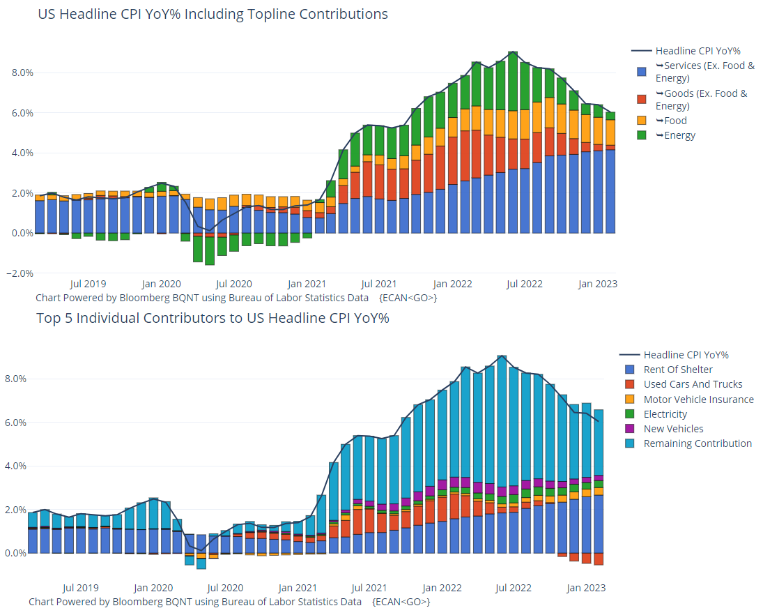
Here are the year-over-year numbers which in aggregate appear to be headed in the right direction.
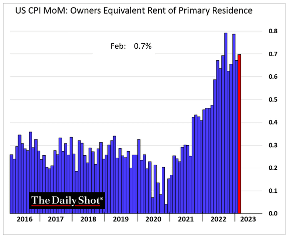
Here's a closer look at the rent component of the CPI.
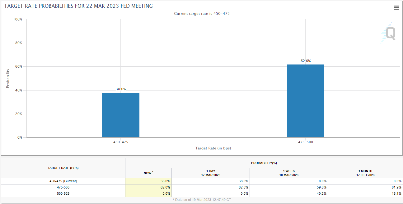
If inflation is cooling a bit and the Fed is dealing with a banking panic, will we get a pause or a moderation of the rate hikes at the Fed meeting on 3/22? Perhaps. As of Friday, futures markets were projecting a 38% chance of a pause and a 62% chance of a 25 basis point hike. It looks like a 50 basis point increase is off the table.
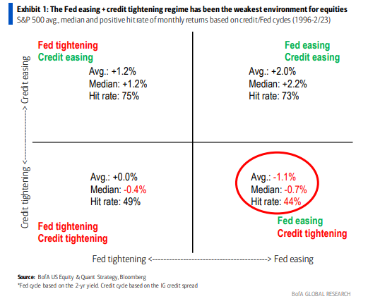
The Fed may be getting less aggressive, but banks are becoming more tight-fisted as this chart shows.
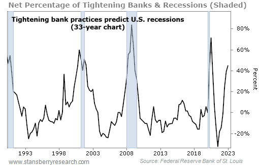
Why does this matter? According to research from Bank of America, the worst environment for stocks is when the Fed is easing while credit is tightening.
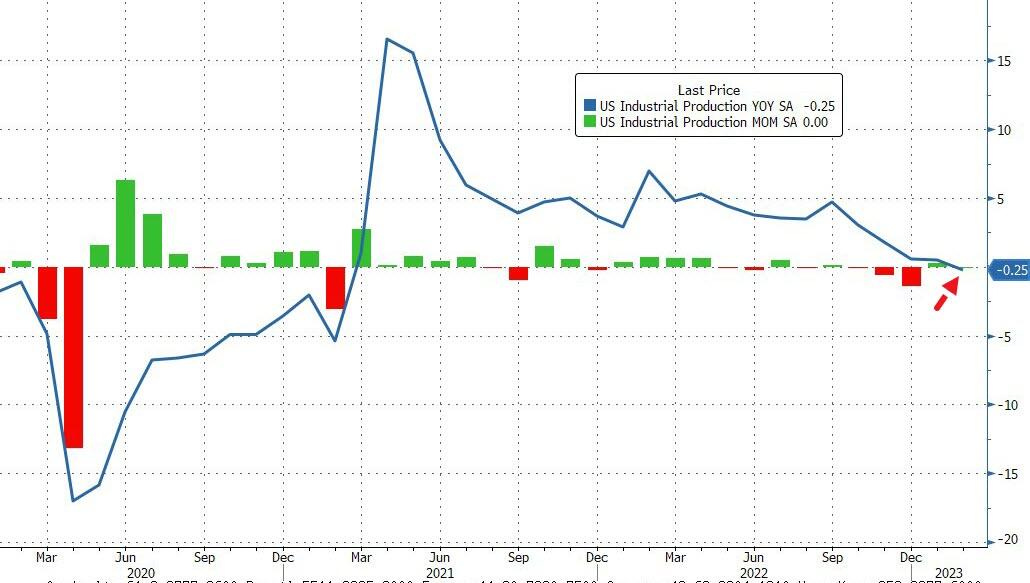
Let's finish with a couple of charts on the economy. First off is industrial production which has slid into negative territory (year-over-year).
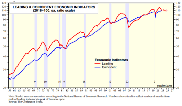
Next up, leading and coincident indicators from The Conference Board. The index of leading economic indicators fell 0.3% in February for the 11th decline in a row continuing to signal an upcoming recession. However, there is no sign of recession in the index of coincident economic indicators.
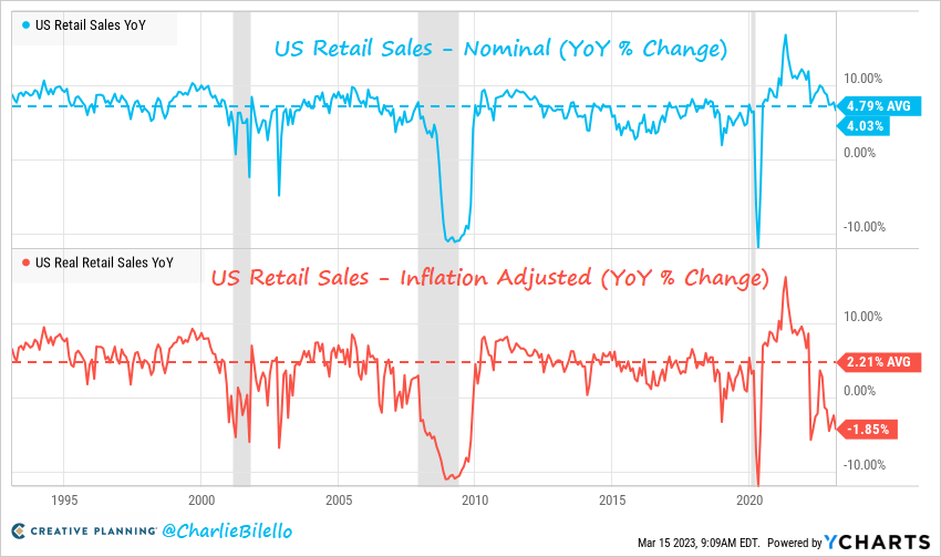
Finally, real retail sales have now declined six months in a row (year-over-year).
It sure looks like there is more turbulence ahead. Better stay buckled up!
Breaking News!
Thank you for reading! I hope you found something of interest in this week's Chart Attack! Find more Chart Attack!s on the Under A Buttonwood Tree homepage.
Chart Attack! is only available to subscribers of our newsletter, Under A Buttonwood Tree. If you're not a subscriber and would like to be, click the subscribe button and sign up. There is no cost for either the newsletter or Chart Attack! (You can also subscribe on the Home Page.)
Are you receiving too many emails and would rather read Chart Attack! on our website? Just let me know by email and you will be removed from the mailing list.
Our email address is under.a.buttonwood.tree@gmail.com
Remember, Chart Attack! is only available to subscribers of Under A Buttonwood Tree, so be sure to subscribe for access!